top of page

Identity for the X Russian short film festival “The Short”,which every year in late August in Kaliningrad.
The target audience of the project is divided into 3 segments:
The main goal of the project is to find a metaphor that will not only reflect the sound name, but also accurately hit the target audience, to form a “voice” and the image of the festival.
Famous filmmakers, movie actors, producers, invited jury, who are ready to give their experience to new faces
Young directors and producers who are just beginning their journey to the cinema
Residents of Kaliningrad who share a love for cinema

The project should be based on the following key words: “The Short” is cinema, local, expertise, openness, youth, brevity, speed, time. And the main idea and core value became:
“The Short - it’s time”
One of the key elements of the watch became parts that resemble a beam from a searchlight in a dark cinema room and a timekeeping from 3 to 24 minutes. It is within this framework that the works for the festival are accepted. The ray with three minutes symbolizes the beginning of the time report, and 24 symbolizes its completion.

The project, not afraid to indicate the time, emphasises that the short film is not part of the big picture, but an independent work.
Do not bypass the sound name “Shorter”.
It is this word that has become introductory and sets the communication tone, emphasising the speed.
Logo
The main color
CMYK: 0 0 0 0
RGB: 255 255 255
CMYK: 60 40 40 100
RGB: 0 0 0
The project, not afraid to indicate the time, emphasises that the short film is not part of the big picture, but an independent work.
Do not bypass the sound name “Shorter”. It is this word that has become introductory and sets the communication tone, emphasising the speed. The slogan “Start, short” calls the younger generation not to be afraid of “START”, to start with the short meter
and the festival. The layout refers to the Swiss grid, which also emphasises clarity
and accuracy.
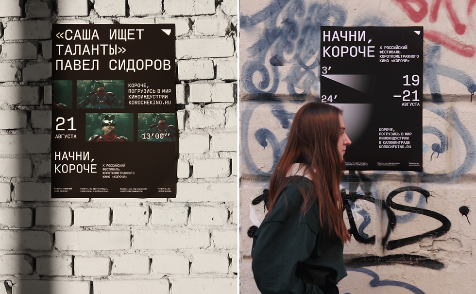
Posters are divided into two tasks:
1. attract participants.
2. attract spectators.
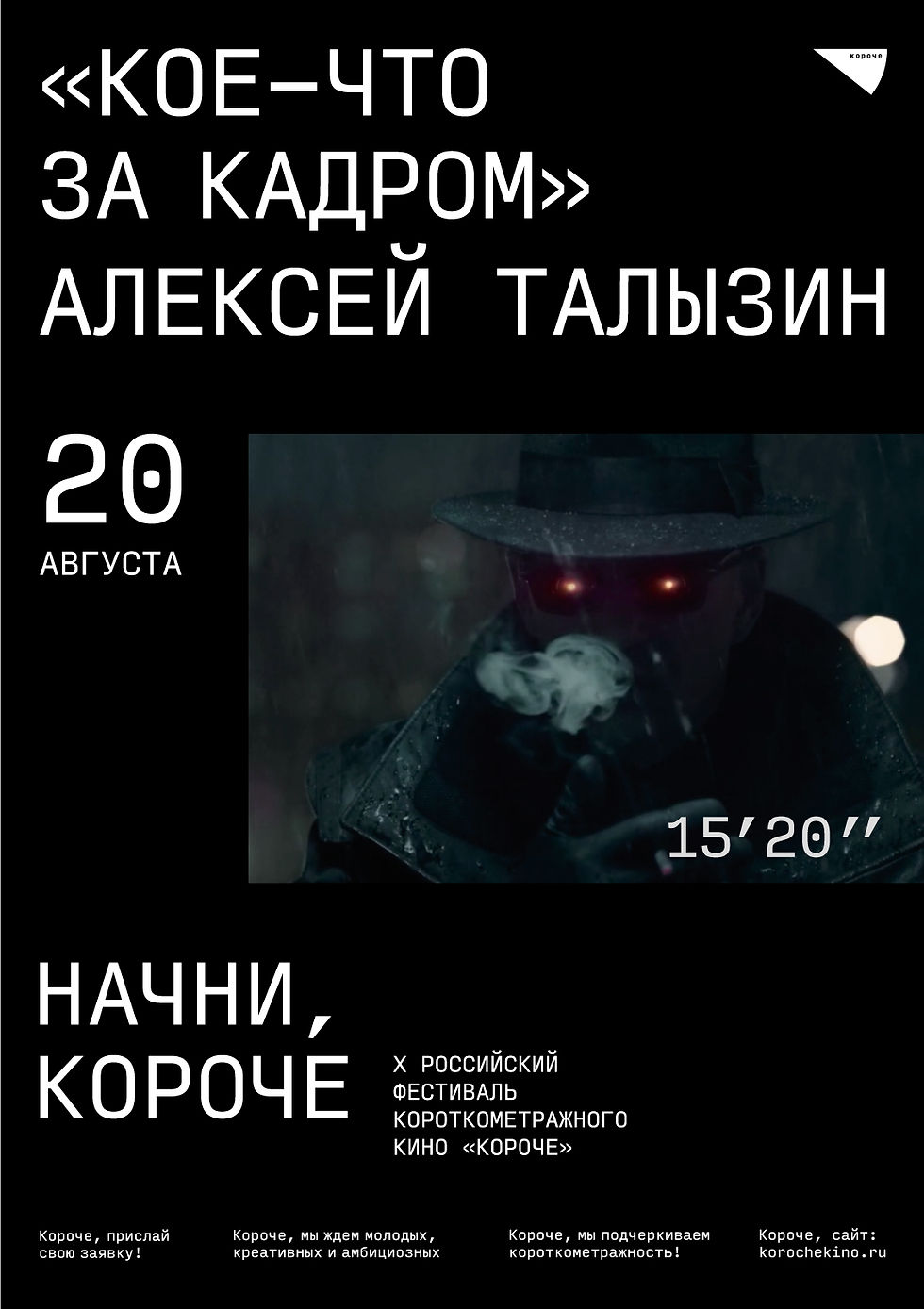
In the first version we rely on the visual component of the clock with reference to the rays in the cinema, in the second festival attracts attention thanks to film posters
where the main role is played by the film and director, as well as the exact time of each film.


Fonts
Developed by David Jonathan Ross, released by TYPE.TODAY. The monospaced font reflects precision and clarity, which corresponds to the metaphor of time.

The grid works well in different formats.
Merch develops and supports the identity, thanks to recognisable fonts, layouts and colours, but also with the help of the logo form new items appear such as badges.


logo sign becomes not only badges, but also navigation system


Social networks and a clear website, but with a characteristic font combination with dates and description of the film, there is an opportunity to learn more about the festival and buy tickets.


behance
bottom of page