top of page
Парус AI (Sail AI) – the company, which is exclusively focused on the B2B segment, specializes in products and services related to artificial intelligence. The Парус AI (Sail AI) solves the complex challenges of a large business, as well as a fairly conservative business and industrial companies through: AI technology bases (LLM, PRA, co-pilot), consulting and cases that can be solved individually from customer request.
Price segment – high.


The overall tone for «Парус AI» («Sail AI») brand was confidence, responsibility, progressiveness and restraint, and each segment received emphasis on those qualities that are most important to it. All communication is transparent and rational. «Парус AI» («Sail AI») relies on high level of expertise and focus on long-term partnership.

«Парус AI» («Sail AI») helps businesses to stay in the right place and navigate the world of complex and fast-changing technologies, managing the course and using artificial intelligence as a powerful navigation tool. The company acts as an experienced guide, guiding customers to innovative solutions and efficient work. The main visual image is left by several constants: references to geographic, marine radar, accuracy and digitization through navigational instruments of tracking in the seas, purity and comprehensibility. We were inspired by the images and solutions of navigational radar and maps, and modified the graphic language to accurately reach the target audience.
The whole grid is based on the aggregation and modification of any navigation map.That is center align, capital font and mono fonts.
The main rule: 4 blocks in height, if it
is vertical, 4 blocks in width, if it is horizontal. The grid is then adjusted to
the maximum approximation of the true square.
The nodes on which the graph is built are created. The total mass of a text always obeys the rule of an isosceles triangle or rectangle, creating stability and confidence.


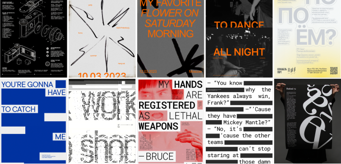
Accent typeface is Biform. It’s a technological grotesque built on the monospace rules, but with the addition
of elegant details. The plastic of the font clearly inherits a monospaced tradition,
but at the same time proportions and elegant ink traps speak to the human character. Created by Aleksandra Dinisova.
To create the block effect, we purposely
use negative leads and always CAPS.
The second typeface is IBM PLEX Mono. It’s an open source font superfamily created by Mike Abbink at IBM in collaboration with Bold Monday. The IBM International Font Family was created to illustrate the unique relationship between humanity and the machine. Has excellent readability in print, web and mobile interfaces.

The main communication colors of Парус AI (Sail AI) are confident and digitial blue, clear white, additional — calm blue and strict black.
It is in these colors that the logo and texts are used, so that there is good visibility and readability due to brightness and contrast. Using the right colors will help to not blur the brand identity.
Additional colors are used in exceptional cases or for a specific purpose. For example, a calm blue-to create a gradient.

Reliable font logo with capital letters based on Biform Font in Regular design, developed by Aleksandra Denisova. The logo is framed by two corner-scales, which speak of scalability, security, and aspiration and refers to geographic or marine maps, since all maps are separated by a frame - scales.


![phone_14_01 [преобразованный]-03 (1) 1](https://static.wixstatic.com/media/13e4cc_7acc961ce6a1469d9535c36e7b8f1b08~mv2.png/v1/fill/w_980,h_1892,al_c,q_90,usm_0.66_1.00_0.01,enc_avif,quality_auto/13e4cc_7acc961ce6a1469d9535c36e7b8f1b08~mv2.png)


behance
bottom of page